In June 2019, my team was given what seemed like an impossible task: to reimagine the Jacobs School of Music website (a 1,000+ page behemoth) as a 100-page site in 12 weeks flat.
But you know what? We not only managed it, we made a darn good website—one I am proud to say I had a major part in creating.
I spent the first six weeks were spent doing extensive research and planning:
- Spoke to dozens of stakeholders from across the school to learn about their frustrations and goals
- Conducted three student focus groups to find out what our users wanted and needed
- Wrote a massive Site Foundation summarizing the research and highlighting key themes that came out of it
- Wrote a comprehensive content strategy that identified our audiences, illustrated the website’s voice, outlined key messages, and created a messaging architecture.
The last six weeks passed in a blur of writing and design, fueled by copious amounts of coffee.
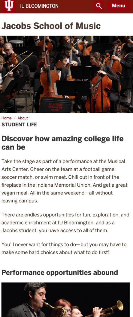
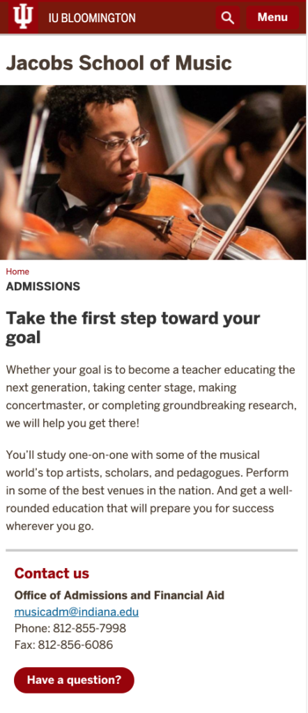
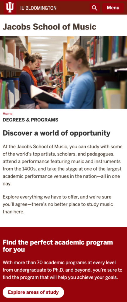
By the time we were done, the new website solved all of the major problems present in the previous design and gave them a solid foundation to build off of. It featured:
- An updated look and feel that helped them compete with other major schools
- An intuitive navigation that allowed users to easily find the information they needed
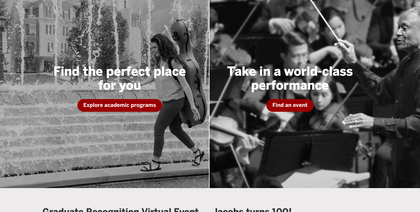
- A home page that quickly directed two key audiences (prospective students and performance goers) to the right places
